

The new, responsive DisneyJunior.com at launch in 2013.
In 2011, Disney faced a pivotal moment. Mobile devices were exploding in popularity, but the company was still entirely dependent on Flash-based web experiences, almost all of which were incompatible with smartphones at that time.
Fresh out of grad school, my mission was monumental: help a small, scrappy team create an entirely new responsive web platform that could be utilized across Disney’s vast portfolio of websites.
By delivering design solutions via sitemaps, user flows, wireframes and prototypes (in Keynote!) I helped launch our new video, games and movie platforms. I also led designs for age-specific, branded experiences such as Disney Junior and Disney Princess.
Despite the challenges of transitioning such an iconic company to mobile responsiveness, maintaining optimism and collaborating cross-functionally ensured our successful launch in 2013, bringing Disney’s magical content to the mobile generation.
Making digital, interactive prototypes helped us test our early ideas with young users.
This example—done in Keynote— aimed to illustrate a visual navigation concept that resonated with the menal model of our young audience. It was also tested with a few of our colleague's children.

Designing a consistent experience for all devices was one of our key product priorities. A "mobile-first" design approach allowed me to determine which elements were the most important to our young Guests and display them first. The team viewed larger displays as a playground, where we could infuse additional elements that brought play and magic to the experience.

Most of our designs began on paper. Armed with post-its and markers, my UX parner and I created the entire app and invited our colleagues to quickly test it. This approach made it easier to dismiss ideas that weren't working and efficiently iterate on ideas that did.

To validate our responsive layouts, my UX partner and I coded our approved wireframes. Working with the front-end technology helped us empathize with our developers and resolve any friction our design may cause them.
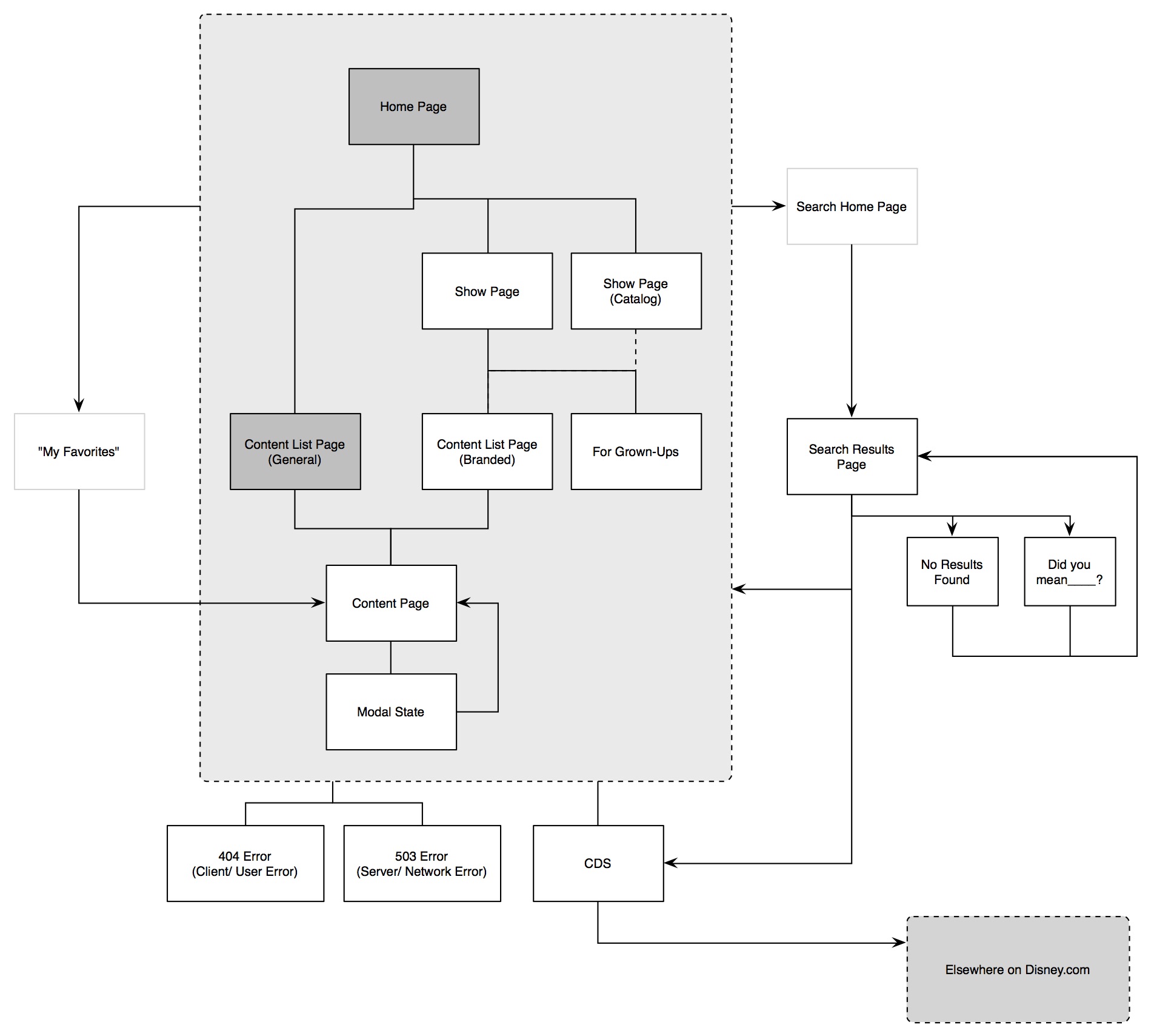
This early user flow map emphasizes the content experience for kids (shown within the gray box). Illustrating this kept us focused on nailing the core experience first. It also encouraged us to remove layers and find even simpler navigation methods.